Todoist
As a user of Todoist, I wanted to see if I could reimagine their logo to fully incorporate the name.
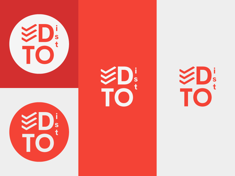
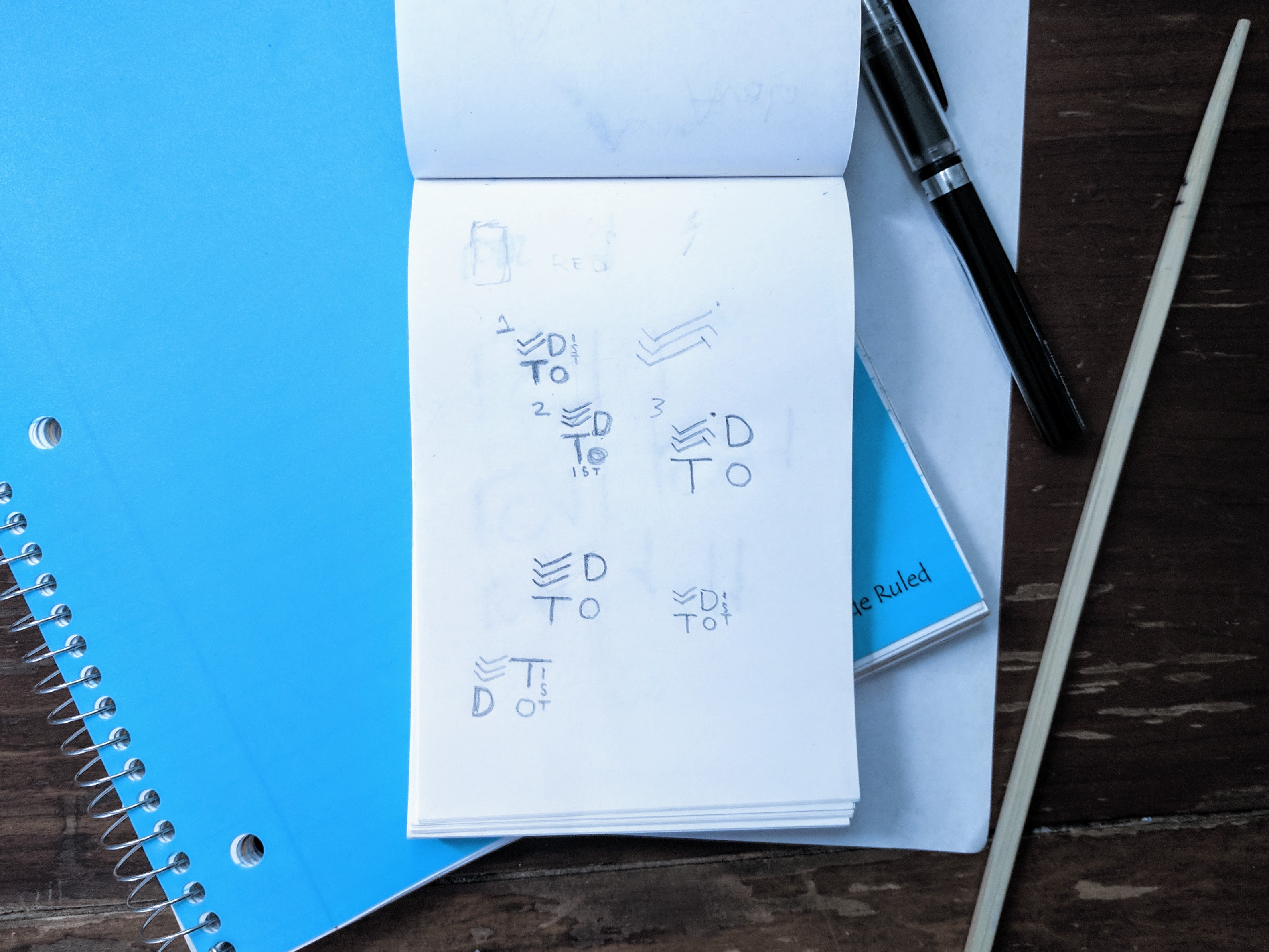
The idea almost immediately came to mind when I started sketching. I had to figure how the letter should be oriented to be properly read. After a bit of research, I came to the conclusion that the “T” should be on the top as our minds naturally read top down, left to right.
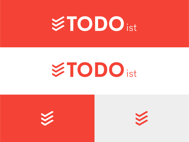
After creating the squared version of Todoist's logo, I realized a landscape version would have to be made for use in web. Without changing to much of the square version, the landscape version perfectly captures the concept.
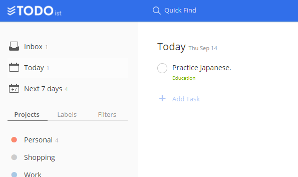
I tested how it would look on the website, and I feel the new concept better defines the brand. Currently Todoist uses their square icon excluding the wordmark
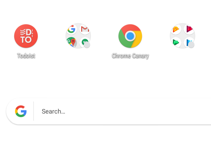
Of course, nowadays, you can't make a logo for a company without it working as an app icon. I created the square version as an icon following Google's Material Design guidelines.
CLIENT
Self
SOFTWARE
Adobe Illustrator
I'll listen
