
Tilt
When creating Tilt's logo, I knew that it needed to look fun, but bold. And /of course/, it needed tilted. I based the lettering on Kilogram for a cool/bold look. The logo needed to be print ready, which presented a challenge when trying to choose bold colors.
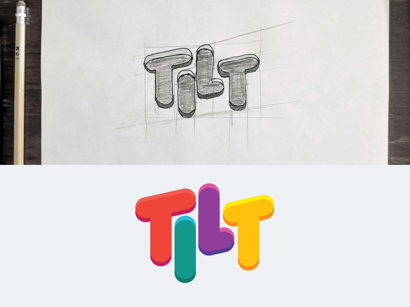
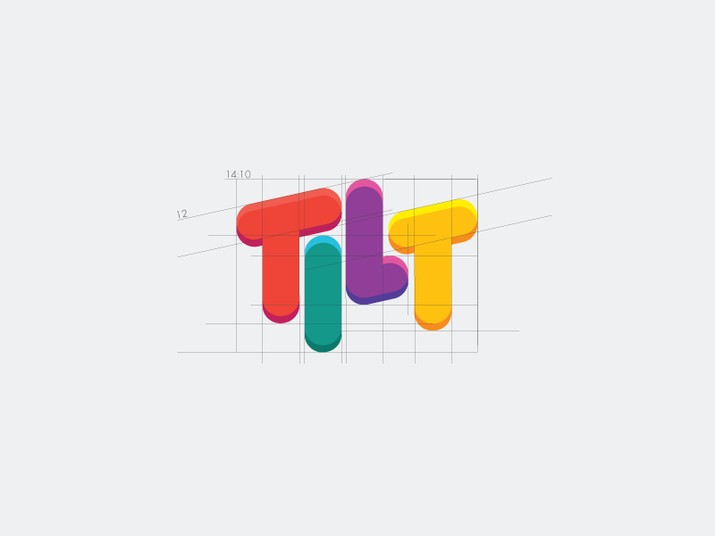
Although I ended up with a high ratio on the logo, I made sure everything stayed perfectly symmetrical and ligned up with something else.
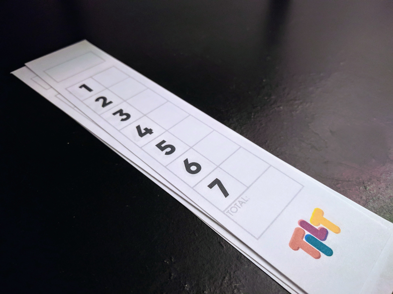
When I presented the logo to the team, they loved the look of it, and wanted me to make their scoresheets. I created something that would be easy to use, and easy to look at using purely geometrical shapes.
CLIENT
TILT GAMES
SOFTWARE
Adobe Illustrator
READY TO TALK?
I'll listen