
M€M€ Logo
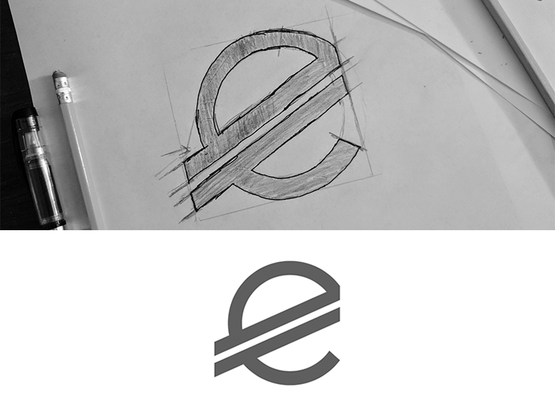
In creating the logo for M€M€, I knew that the design had to have a sense of elegance, while still representing the € symbol used in the wordmark. I studied the euro's structuring, and researched their competetion, then begun sketching. After many hours of conceptualizing, and many ideas, I finally narrowed the logo down to four possible concepts. When presenting the concepts to the client, they had gravitated to this one in particular.
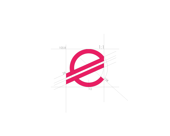
The bars of the logo stick out the appropiate length in exchange for the cutout of the right side of the circle making it perfectly squared. Each angle was taken into consideration during the finalization stage, using precise numbers that harmonize with the others to give it a natural look.
CLIENT
M€M€
SOFTWARE
Adobe Illustrator, Adobe Photoshop
I'll listen