
Jedi Burrell's Branding
You're already here, so you already know my branding is on spot. But let's take a deeper look at the work that went into creating my identity.
Let's take a look at some of the original concepts I came up with. Like all of my designs, this one started on paper. Quite a bit of paper.
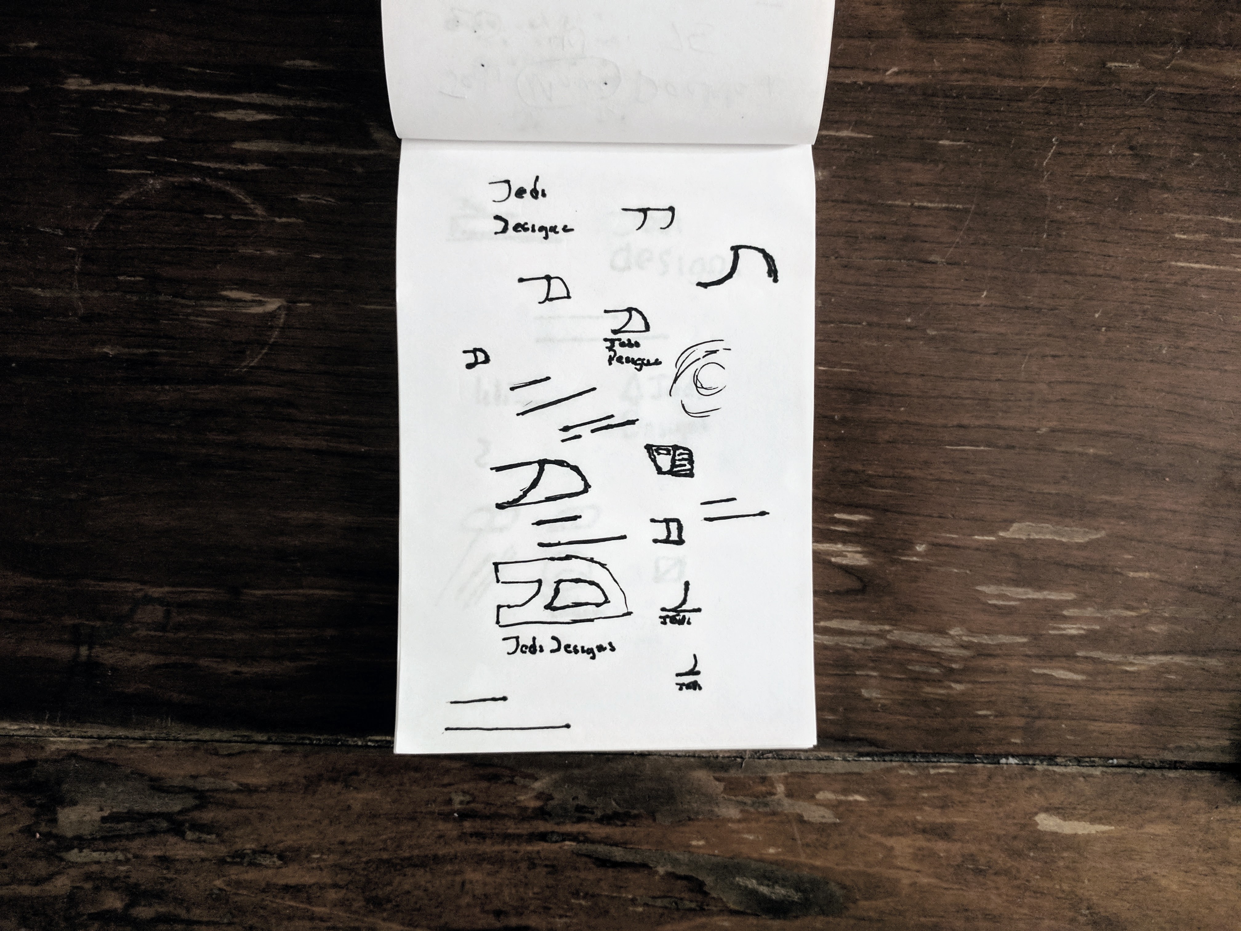
I started with “JD” for “Jedi Designs”, and quickly came to realization that when done properly, it could look like a paint brush. This obviously works well for me, because paint represents art.
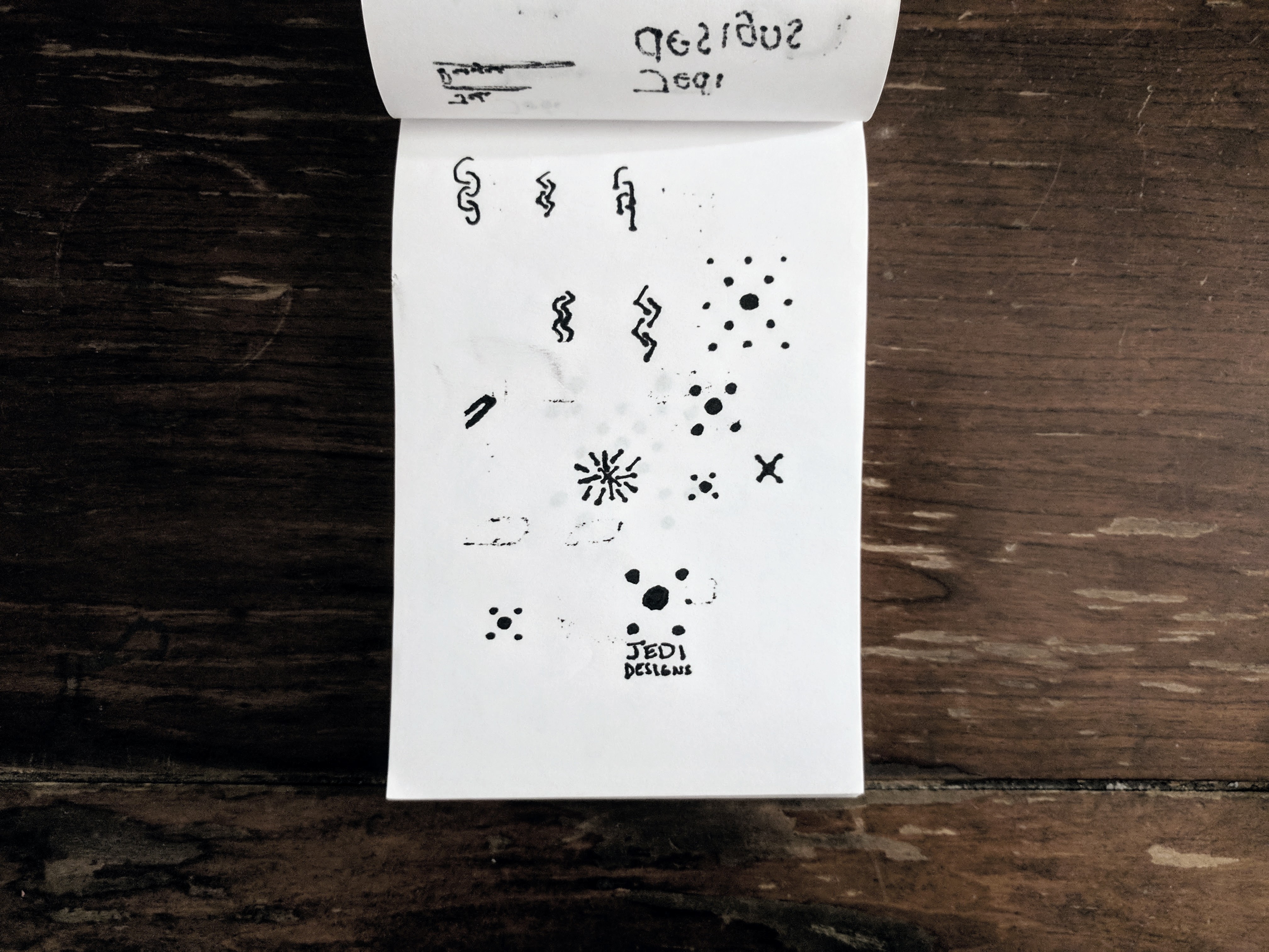
If you can't tell here, this is just splattering ideas onto paper, it didn't work out.
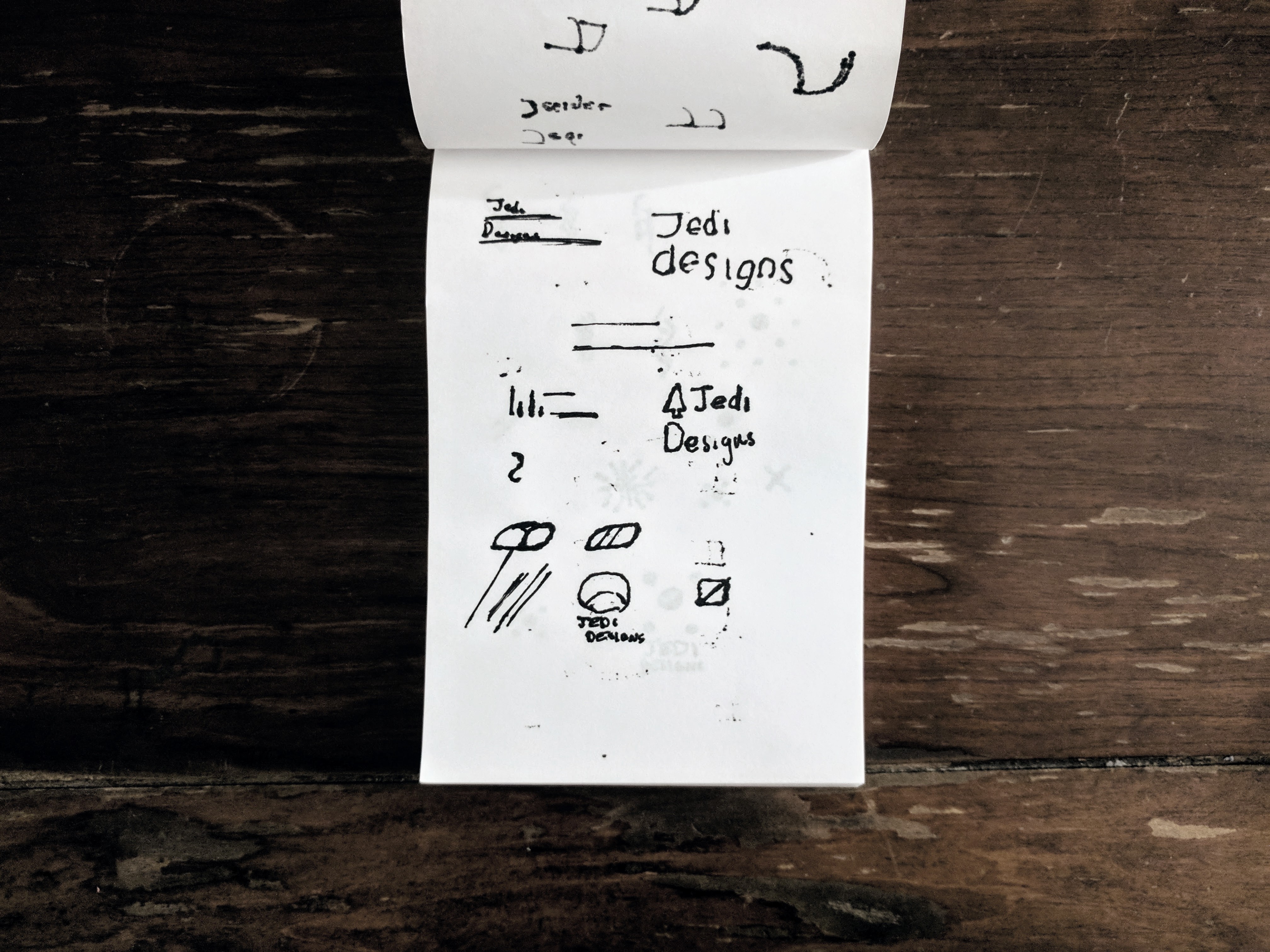
I looked for some inspiration online, and found a lot of amazing personal brandings. I started mixing shapes trying to create some abstract masterpiece.
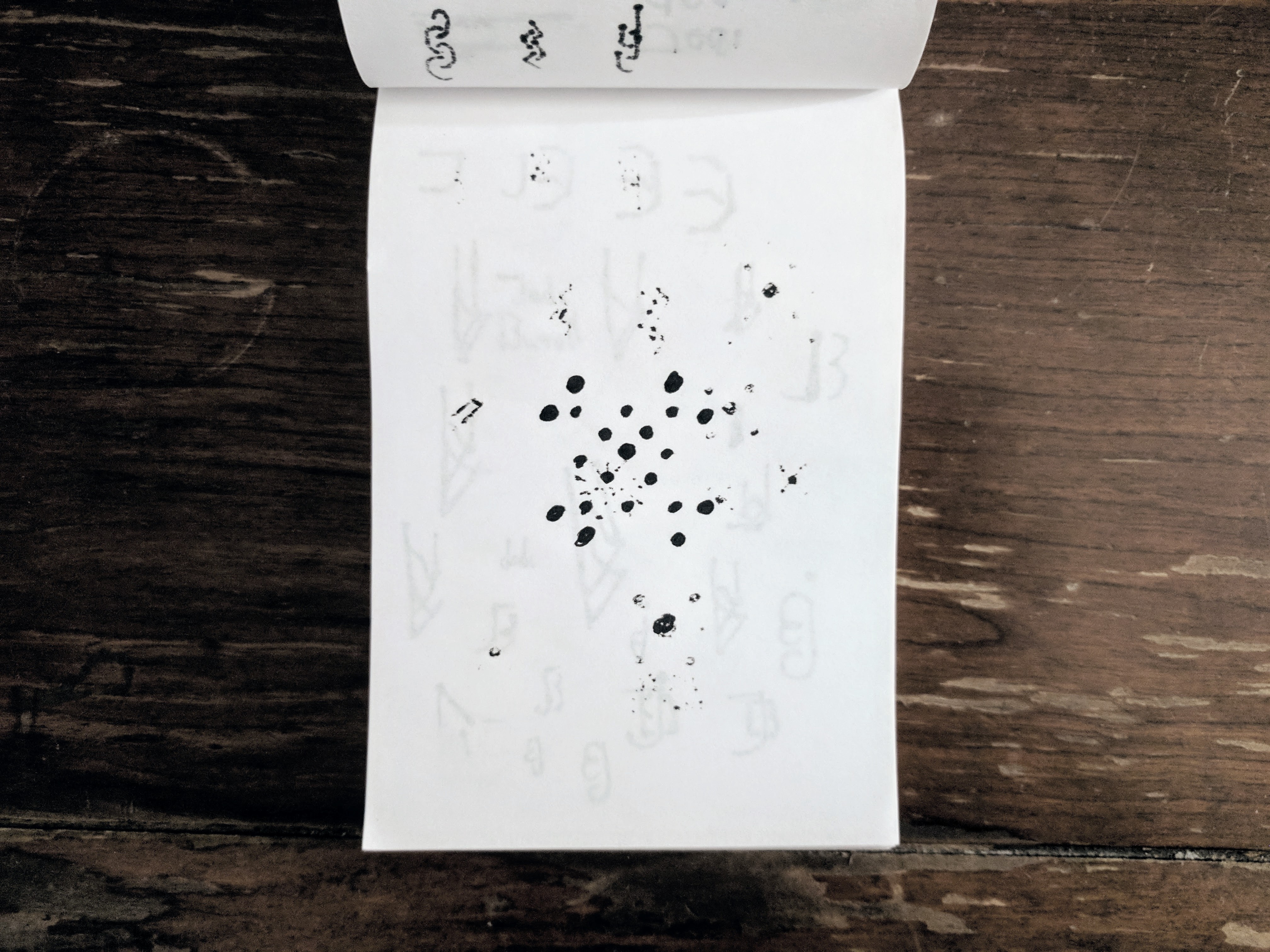
And I did. Dots -- dots looked really cool, I pursued this idea for a bit, animated it, created mockups, and presented it to some people. This had really strong branding to it, but thankfully, I was talked out of using this.
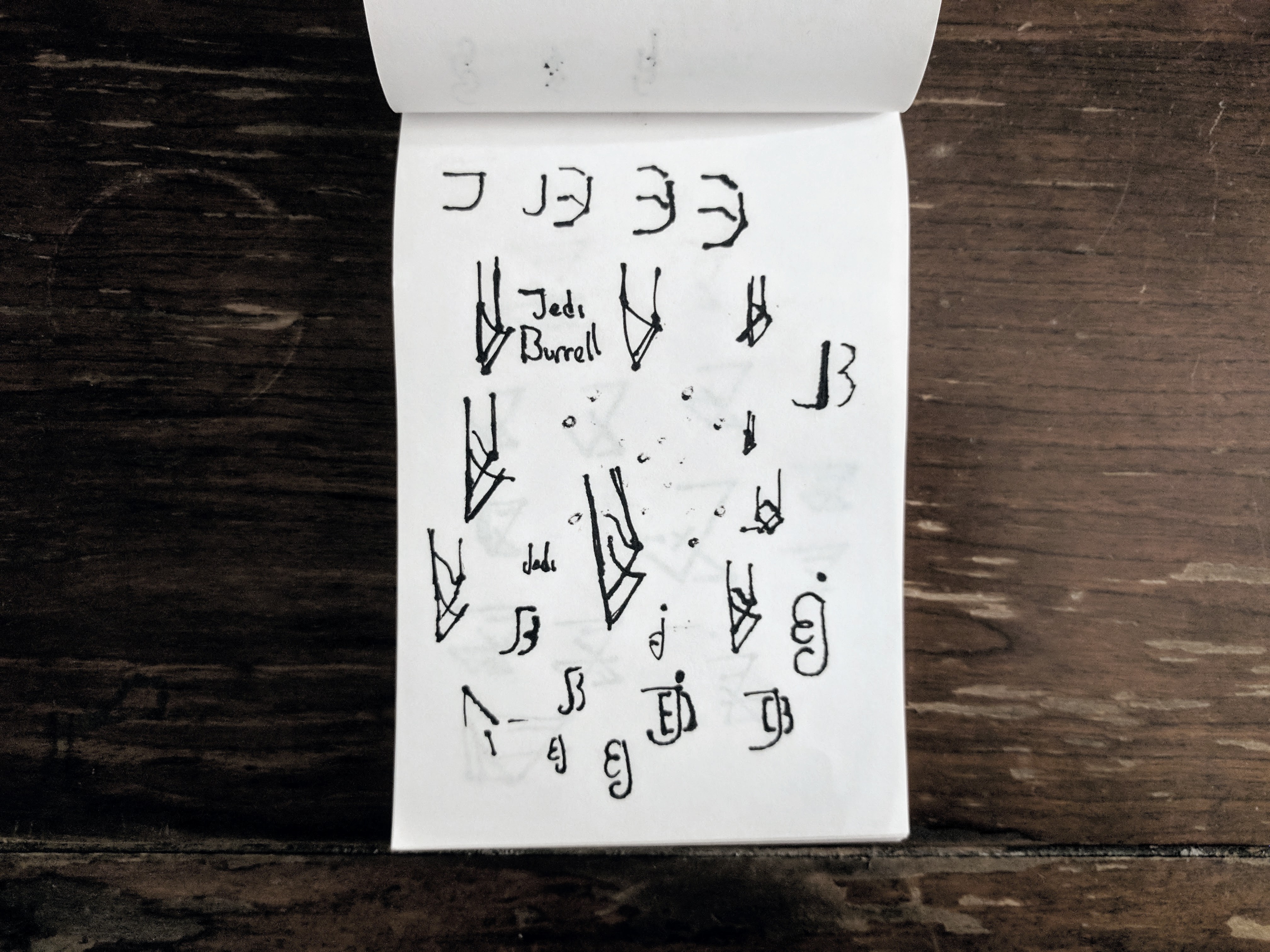
Going back to the first idea, I tried to make a pen instead representing my initials.
This is the first concept leaving “Jedi Designs” for my name.
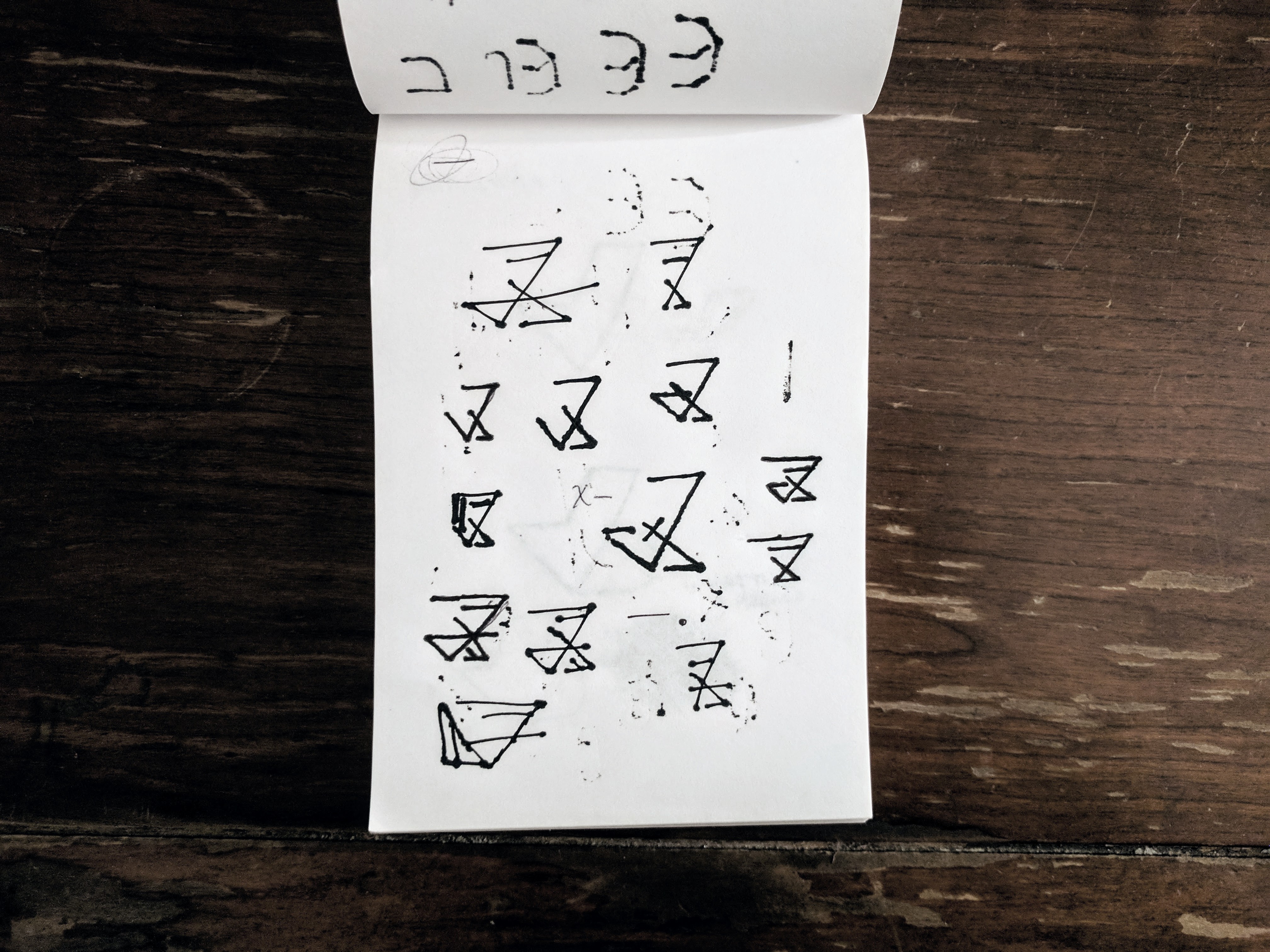
Side note: see the sign in the top left corner? That was my first personal logo, which I used for far too long.
I later found out when I decided to study Japanese, that is a hiragana letter that makes the “fu” sound.
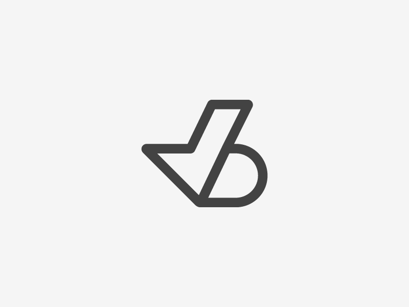
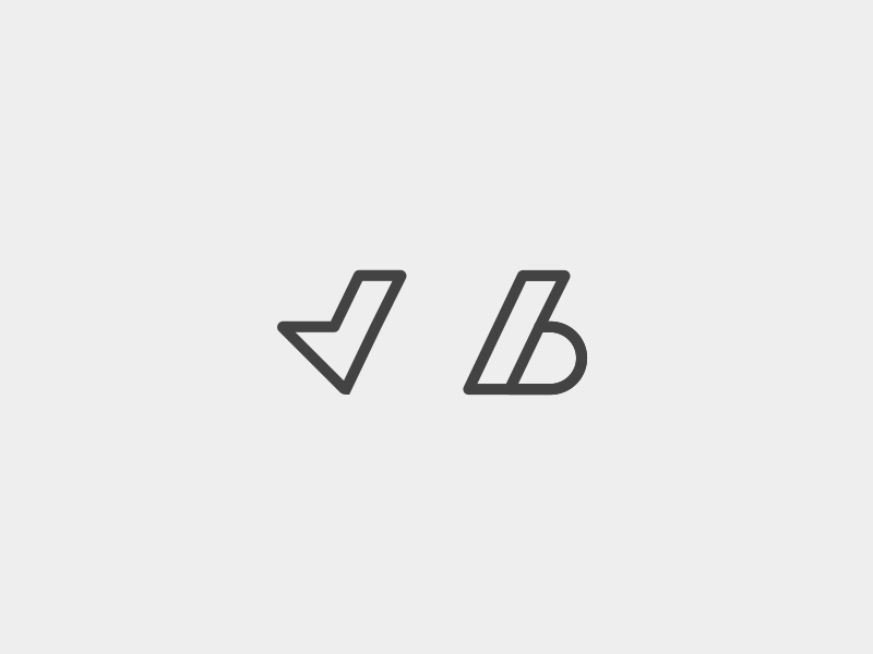
I decided to try to make a line mark of my name. The results weren't great, but it lead to my final mark.
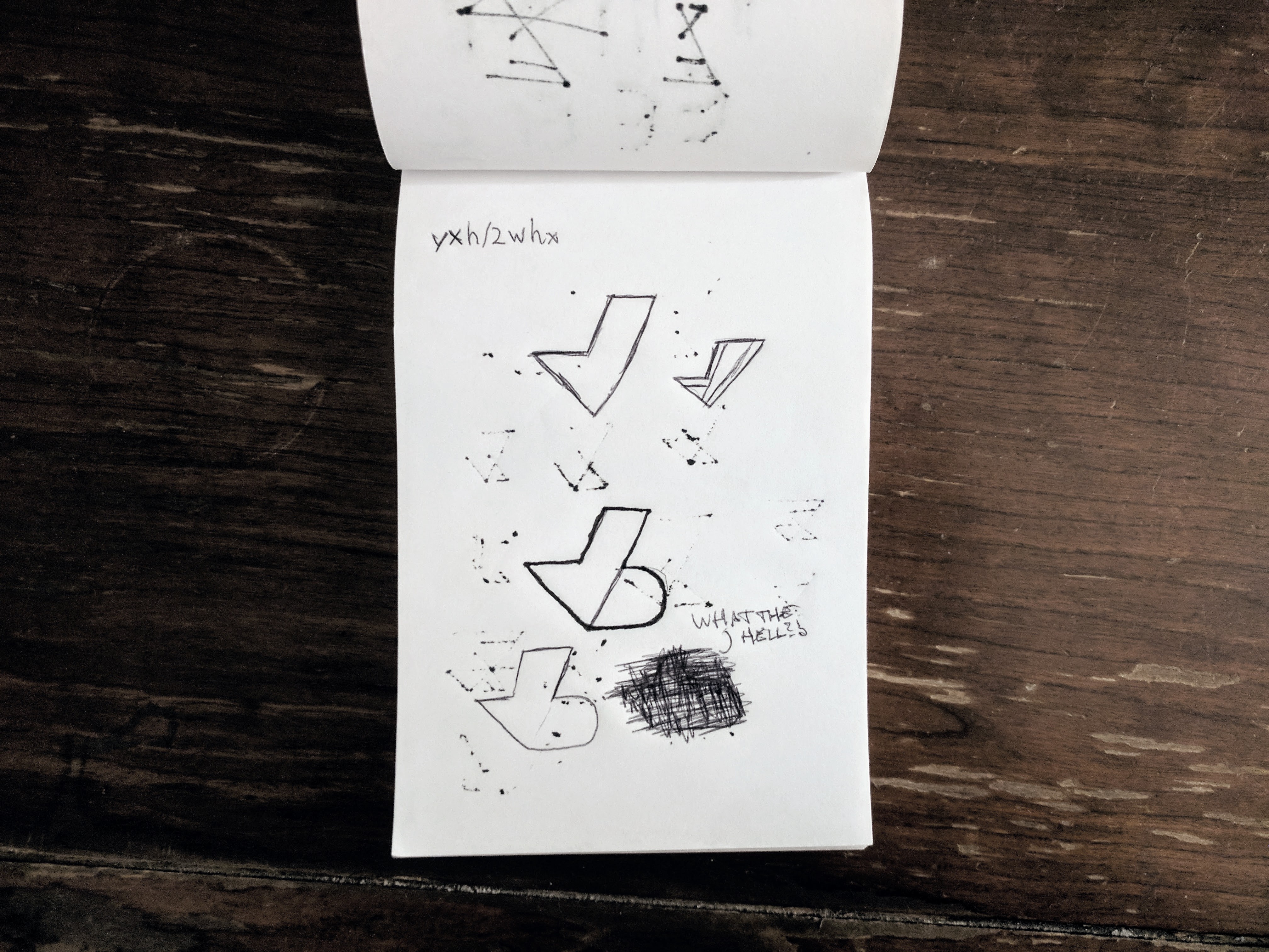
I finally got it. Mixing “J” and “B” in the least obvious way possible. I created a simplistic, beautiful mark. I immediately jumped up, ran to my workstation, and began finalizing.
CLIENT
Self
SOFTWARE
Adobe Illustrator, After Effects
I'll listen